Click Here to visit the Bulletin Board HOME
![]()
The CMB 'blackbody' curve is considered to be one of the 'pillars' of the Big Bang Theory. After about 400,000 years, the cosmic soup that had formed in the initial 'bang' had cooled to around 3000K, radiation and matter 'decoupled' and the universe became transparent. That is, the radiation ceased to interact with matter and these photons that were left, expanded along with the universe. As these photons were stretched (or so the story goes) their wavelength increased and the 'temperature' cooled. This radiation is all around us and said to be the Cosmic Microwave Background radiation - CMB for short. In the story, Gamow is supposed to have predicted its present day existence as an 'echo' of the bang, and he predicted its temperature to be around 5K - and he did this long before Penzias and Wilson 'discovered' the existence of the ESCUELA. The fact that Gamow had changed his mind and put the temperature at around 50K before the 'discovery' of the CMB is now long forgotten as Big Bangers cling to the original prediction in order to support their Theory. Nor do they remember that the CMB had already been 'prediscovered' in 1945 at a temperature of 3K or so by a guy named McKellar - and Gamow knew of this. But enough of the history, lets look at the CMB blackbody curve. In the Big Bang story, the remnants of the CMB should have a spectrum similar to that of a 'blackbody'. A 'blackbody' is a Physics term for something that is a perfect emitter or absorber of radiation. The shape of the curve is well known and depends upon the temperature.
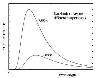
Here are a couple of blackbody curves to
give some idea of their shape.
When NASA's FIRAS instrument on the COBE satellite measured the CMB spectrum and gave this:
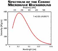
(click on the picture to give the link)
Everyone was happy because the curves look identical!
BUT, wait a minute, that wavelength scale looks a bit funny. Lets look at the divisions, 1, 0.2, 0.1, 0.07 don't they seem a little strange? A typical blackbody curve has intensity plotted against wavelength - with a linear scale. I mean, if it is an intensity/frequency diagram then why not put the frequency scale at the bottom? Why put wavelength at the bottom of your graph, with a strange non linear scale to boot, if you are plotting against frequency?
When it comes to the CMB, most curves are plotted against frequency. For instance, Ned Wrights pages plots the intensity against 'wavenumber [/cm]'. Why not use the traditional 'wavelength/cm'? They look similar but 'wavenumber[/cm]' is nothing like the 'wavelength/cm'. What Ned plots is the intensity against the 'number of waves in one centimetre'. Why 'one centimetre'? why not one metre or even number of waves in one second or even one week!
Is it because 'wavenumber[/cm]' looks like 'wavelength/cm' to a casual observer? No that can't be it - can it?
Lets look elsewhere, and go back to nasa.gov this curve plots intensity against 'waves/centimeter' Now, this is not 'wavelength in centimetre', but how many waves there are in one centimetre. You see when we draw graphs we commonly state the quantity divided by the unit. 'Wavelength measured in centimetre' would be written as 'wavelength/cm'. What they are all plotting is intensity against frequency curves - nothing wrong in that, but why don't they state that it is frequency in hertz, Hz, that they are plotting. Why all these referrals to things sounding like 'wavelength' when it is frequency they are plotting?
Now, I am not in the least bit cynical (!), but someone who was might think that it was all a con. That is, trying to make us think that these 'intensity frequency' graphs are 'intensity wavelength' graphs. The graphs 'look' like the traditional blackbody curves only when they are drawn against frequency. What does the Firas data 'look' like when it is drawn in the 'blackbody' way of intensity against wavelength? Lets have a look:
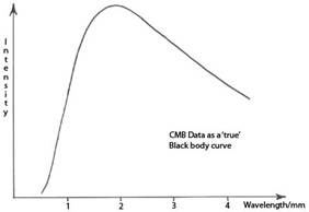
CMB curve Typical Blackbody curves
Not as convincing is it?
The point I am making is that there is no problem in drawing intensity frequency graphs as they do, but if you must do this, then call the graphs just that. Label the axis 'frequency/Hz'. Don't use 'waves/cm', or wavenumber[/cm] and certainly don't label the bottom axis in wavelength and then use a non linear wavelength scale.
If you are drawing an intensity frequency graph label it that way. The data is blackbody as stated. OK, the curve doesn't 'look' like a typical blackbody curve when you do that, but so be it. If the Big Bang Theory stands up to testing, then there should be no problem in drawing and labelling the graphs in the standard way.
© All rights reserved. Lyndon Ashmore, June 2005